Any packaging design is an amalgamation of two elements—images and typography. You might think that only graphic imagery will be enough for your boxes. But that’s no longer the case; without typography, you make your customers miss out on important information. You create a barrier between your customers and your brand. That’s why, with the help of the right typography, you can communicate and connect with your customers.
You can streamline your product details and brand’s information with the help of typography. A visually appealing design with the typography is just the right marketing approach for you.
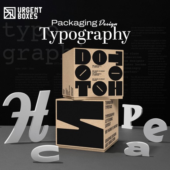
What is Packaging Design Typography?
Typography in your packaging design is an important use of fonts. These fonts can be found in a wide variety. Every font will have a unique pattern, size, and layout. The right type of font can help you evoke certain emotions in your customers. Your typography can either throw your customers off or tempt them into making a purchase. Therefore, you need to be extremely considerate and careful about the type of fonts you use. And if your typography aligns with your intended customer’s interest or not.
Why is Typography Important for Your Packaging?
Have you ever had a look at an aesthetically pleasing packaging box? After having a look at the design, you must have thought about knowing more. But you can’t, because there’s no typography on the box. This is why typography is important. As it helps your customers learn about you. Let’s take a look at some important features that will help you understand the role typography plays in your packaging design:
Creates Brand Recognition
Every business owner wants people to recognise their products and brand. Just a simple design won’t help you achieve this objective. By adding your product's logo, details, and tagline, you can make people more aware of your brand. You can help them learn about your values, mission, and objectives.
Increase Sales!
Customers are always attracted to creative and innovative packaging boxes. By choosing customer-centric, professional, and creative fonts, you can get your customers' attention. Moreover, you can also choose certain fonts that can evoke specific emotions about a product. You can also use a storytelling approach through these fonts.
Professional Look for Reliability!
The accurate font size, style, and layout create a professional packaging design. The professional look of your boxes allows your customers to perceive you as a reliable and trustworthy brand.
Key Elements of Typography for Your Custom Boxes!
Let’s explore a few important elements for your packaging design typography:
1. Size of Your Font
The accurate font size can make your packaging look elegant and visually appealing. Imagine looking at a box, but the text on it is not redacted. Will it throw you off? Yes, it will! It will also confuse the buyers. Therefore, the accurate font size will only make your design more appealing and clear.
2. Line spacing
Line spacing is the space after every word in your design. Your packaging design is made up of various information. It includes your brand details, logo, taglines, product usage, benefits, and ingredients. All of this information needs to be clearly displayed. If you put the words too far or too close, the design will lose its purpose. That’s why it is extremely important that you choose consistent line spacing through overall packaging design.
3. Hierarchy
Not every feature and piece of information is significantly important on your packaging. That’s why, with the help of hierarchy, you can guide the reader towards the most important information first. Primary, secondary, and tertiary are three basic levels of hierarchy. Primary level contains the most important product's information, while the rest of the typography falls in secondary and tertiary areas. Hierarchy makes the information and design visually appealing and clear.
4. White Space
Whitespace is important for a clean design look. It allows the customer’s eye to easily wander over the box. It helps them to look at an elegant and neatly designed package. The whitespace plays a great role in minimalistic packaging design themes. Therefore, choose your fonts that adjust well with the whitespace element.
5. Alignment
Text alignment means positioning your text on the design. Four types of alignment positions include left, right, center, and justified. Align your text where you think it will be the most noticeable. Your packaging design will help you position the typography the right way.
How to Choose the Most Suitable Typography?
You need to consider the following aspects of your packaging while choosing the right type of product typography:
Type of Product
Determine the nature of your product. You can’t choose the same typography for jewelry and food boxes. You need professional typography for high-end and premium products. But if your brand has a fun and creative vibe, you can play around with some interesting fonts.
Size and Style of Your Boxes
Your typography should align with your packaging’s appeal. That’s why you need to choose the font style that matches your box style. For plain fonts for simple packaging and for aesthetically pleasing box styles, you need to choose professional fonts.
Fonts for Labelling
Fonts like Georgia and Open Sans are ideal for product labeling. These fonts display your product information vividly. Furthermore, whenever you’re choosing your font style, keep in mind your target audience. Who are you creating your boxes for? What do they prefer? What is their age group? All this information needs to be considered before choosing the font for your product labeling.
Mistakes to Avoid while Choosing Your Typography!
Here are some common mistakes that you can avoid while choosing the right type of font for your design:
- First off, do not overcrowd the use of your fonts. Choose the right and a few types of fonts. And make sure you stay consistent with your font style on your packaging design. Every font should fit in the design well.
- By choosing fancy or bold fonts, you sometimes miss out on the readability aspect. You make it hard for the customers to read the text clearly. Therefore, avoid any such error.
- Choose consistent text alignment. Don’t put the text too far from one another. Make sure that the buyer doesn’t have to put effort into finding the right alignment of the information.
Trending Typography Designs for Your Packaging!
If you want to attract your customers, here are some trendy packaging designs that you need to follow:
Creative Geometric Design
This type of typography design contains unique shapes like squares, triangles, and circles. Thai design is visually appealing and can easily grab your customers' attention. It is ideal for creative and intriguing packaging designs.
Minimalistic Design Approach
This typography design promotes elegance and simplicity. It has no overcrowded typography design. Moreover, it is easy to read and looks good to the eye. It is ideal for your high-end brands that only want to display the imprint brand information.
Framed Style Typography
As the name suggests, this typography design consists of all the information in one frame. The frame theory instantly guides your customers to the text. It is easy to read and highly captivating.
Conclusion!
We hope this blog helps you in choosing the right typography for your packaging design. If you need any more help, feel free to contact Urgent Boxes. Our design experts can help you choose the most accurate font style for your packaging.