Branding and designing are all about the accurate color shade. Inconsistent color schemes and shades can severely damage your brand’s reputation. Colors create an aesthetic product appeal. It captures customers’ attention and shows your brand’s value. To make sure that your color printing stays exactly the same on every product and its packaging, you have the Pantone color matching system!
What is a Pantone Color Matching System (PMS)?
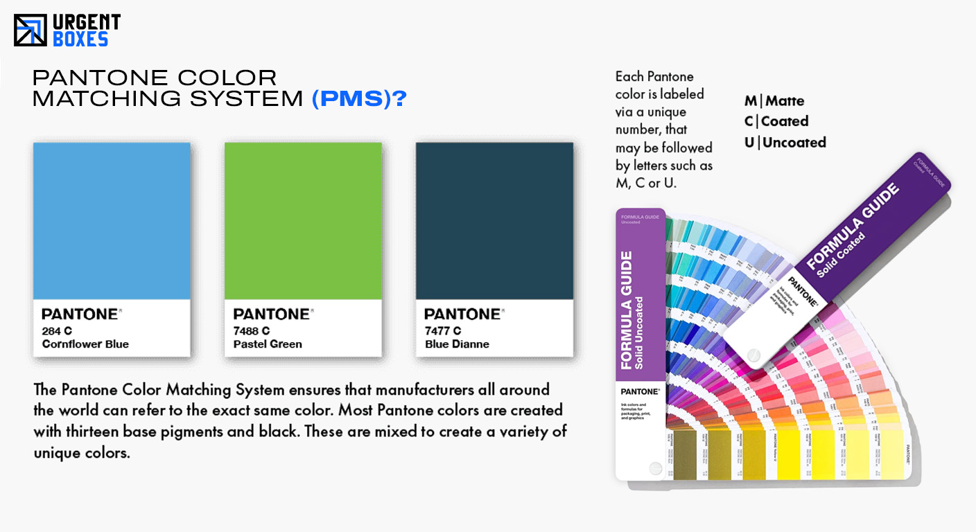
Pantone Color System is a globally used technique used by designers, engineers, and manufacturers to identify the standardized colors for printing and packaging. It was introduced in 1963. Pantone helps people in every industry by providing accurate color printing. The true roots of this color-matching system found in the packaging and printing industry. Which means, it is being used by all industries. Every Pantone color has a specific code. Therefore, people using it in Japan or Canada will get the same color accuracy through this matching system.
Let’s make it easy for you! Whenever you see a Coca-Cola ad, you get to see a bright red label on every bottle. But what if two bottles had a bright red label, while the others had a dark red label? Will it confuse you? Yes, it most definitely will. Because colors help people create emotions and build trust. So, by choosing non-unified colors, you will only create confusion and distrust in your customers.
How Does the Pantone Color Work?
The Pantone system provides an extended range of color guides and tools. It helps people choose the right Pantone shade. Moreover, you don’t have to mix or blend different shades to obtain the accurate Pantone color. Instead, Pantone shades are already combined. So, all you have to do is pick the color you want. Additionally, this color accuracy can be obtained all over the world.
The Use of Base Pigments and Pantone Guides!
Base pigments play a significant role in the working of the PMS system. There are almost sixteen basic pigments in the Pantone Color Matching System. Each of these pigments comes together to create the perfect Pantone shade. The proportion of these pigments is pre-decided. Moreover, every shade of Pantone is achieved by using these base pigments. These pigments create accurate and consistent color results. This factor helps the designers bring their vision alive.
Each Pantone color looks different depending on the surface it is applied to. The PMS Color Matching System provides the ultimate guide and design tools to designers, printers, and packaging manufacturers. These Pantone guides are there to help you in choosing the right color scheme. It informs you about your color code and its formulation process. It ensures that you get the same color results that you envisioned.
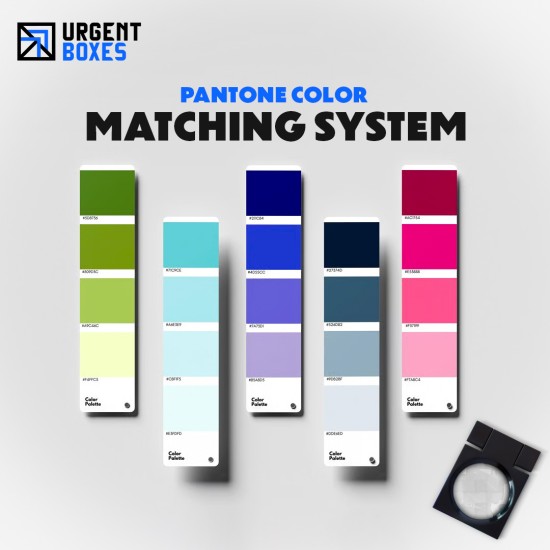
Explore Versatile Pantone Palettes!
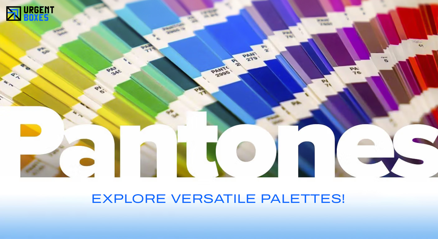
PMS Matching System has a variety of color palettes. Every color palette produces a unique and satisfying color shade.
Let’s take a look at a few of the interesting color palettes for you:
Pantone Solid Palette:
It is the first and original Pantone palette. It has no relation to CMYK, and it has more than 1000 color shades. It is most widely used for branding and custom packaging solutions. Pantone solid palette can be found in coated and matte finishes.
Pantone Process Palette:
This color palette is obtained by remixing the four CMYK colors. This processed palette contains at least 3000 color shades. It is mostly used for flyers, brochure printing, as well as printing magazines and books. One reason that most people prefer this method is its cost-effectiveness.
Pantone Plastic Palette:
As the name suggests, this palette is designed for plastics. It can print all types of plastic surfaces, including opaque, transparent, and even tinted ones. It is mainly used in industries such as electronics and packaging. This color palette consists of hundreds of thousands of different shades.
Geo Palette:
This color plate was introduced to bring a creative and more modern design upgrade with the help of unique colors. This palette follows a modern color approach. And instead of a numeric arrangement, they are categorized with the help of chromatic rainbow order. It consists of more than 2000 colors.
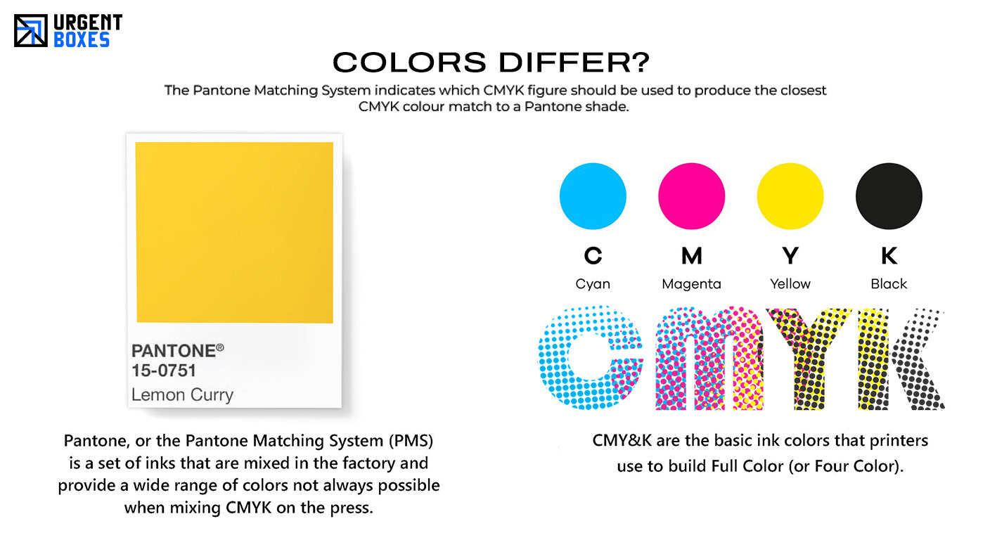
How Do the Pantone and CMYK Colors Differ?
There are not one but various factors that make both these color systems different from one another.
Let’s take a look at some key differences:
● CMYK color technique only consists of four shades that include Cyan, Magenta, Yellow, and Black. All of these colours are individually printed and then combined for a layering procedure.
● Unlike CMYK, PMS can print a wide range of colors. This system doesn’t rely on four colors only. It has a wide color palette.
● CMYK printing doesn’t offer high-end and accurate color printing results. But, PMS offers the identical color results. This color accuracy and consistency give the PMS system an upper hand over other color methods.
● CMYK is ideally used for full-color printing, magazines, brochures, and custom packaging boxes. Meanwhile, PMS is mainly used for printing logos, custom packaging, and branding purposes.
Benefits of Pantone Matching System for Your Brand!
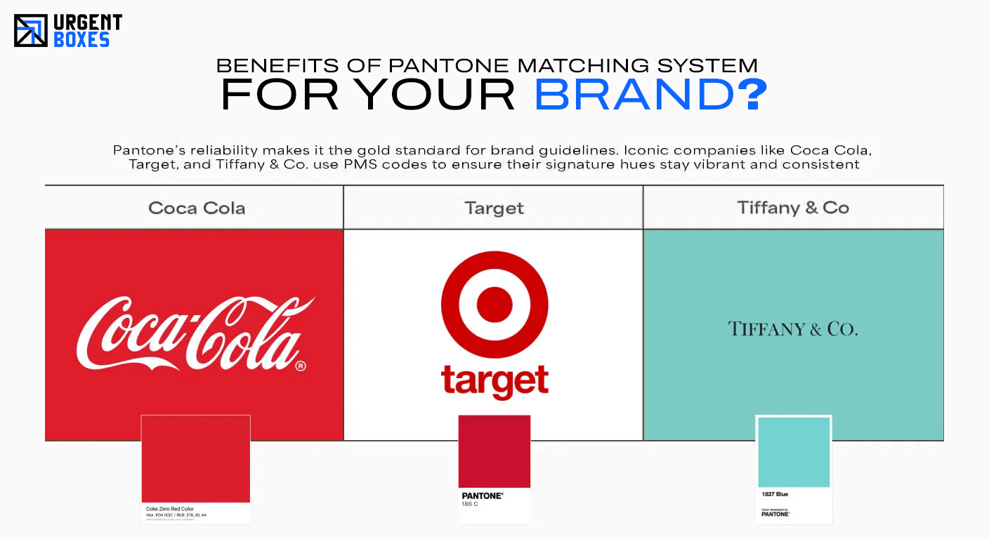
Pantone Color System offers endless benefits. It stands out as the number one color-matching system being used worldwide. These Pantone colors are quite important for both the packaging and printing industries.
Here are some of the top benefits that this color system offers:
Strengthens Your Brand Image
Every business wants to portray a strong brand image. With the help of aesthetic designs created using Pantone colors, you can stand out. You can make your logo and other branding highly visible with these colors. Moreover, the increased visibility will also attract a lot of customers to your brand. It will help you in creating a unique brand identity. You can’t disagree when we say colors evoke certain emotions in people. By using the right color approach, you will be able to strengthen your brand’s image.
Maximize Your Sales Potential
Customers prefer buying quality products. The color accuracy achieved through PMS will allow your customers to learn about your product’s worth. It will also give them a chance to know about your brand and its values. This color system allows you to achieve the same colors that you want. The color accuracy will make your designs look more professional and appealing. This way, you can attract potential customers and boost your sales.
Consistent Branding Results
No business wants its customers to get confused about their products. This can be avoided by achieving similar printing results for all products. PMS allows you to achieve precise and consistent color results. This creates a solid brand reputation for you and allows suite customers to interact with your products.
Conclusion!
To achieve color perfection for your modern printing and packaging designs, the Pantone color matching system is all you need! Feel free to contact Urgent Boxes to discuss every detail of your Pantone color matching system. Our team will help you out with it all!